
Introducing- Polar Plots
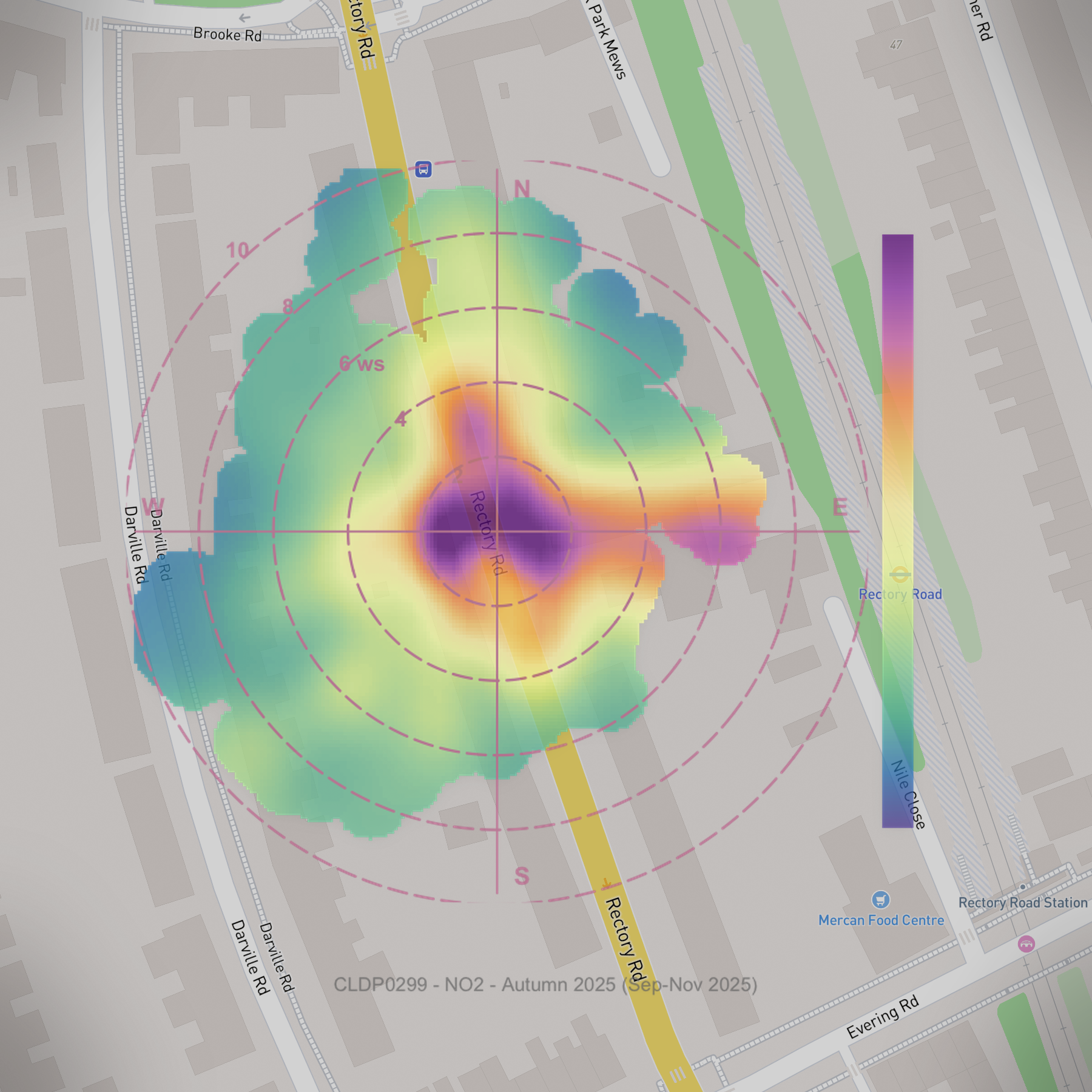
New visualisation tool launched to help Community Groups interpret pollution direction
“Where is the pollution coming from?” - This is one of the most common questions we heard from our Community Groups over the past year.
To help answer this question we have worked with our data group over the past few months refining this and we are really happy to launch this new tool on the Community Group node pages.
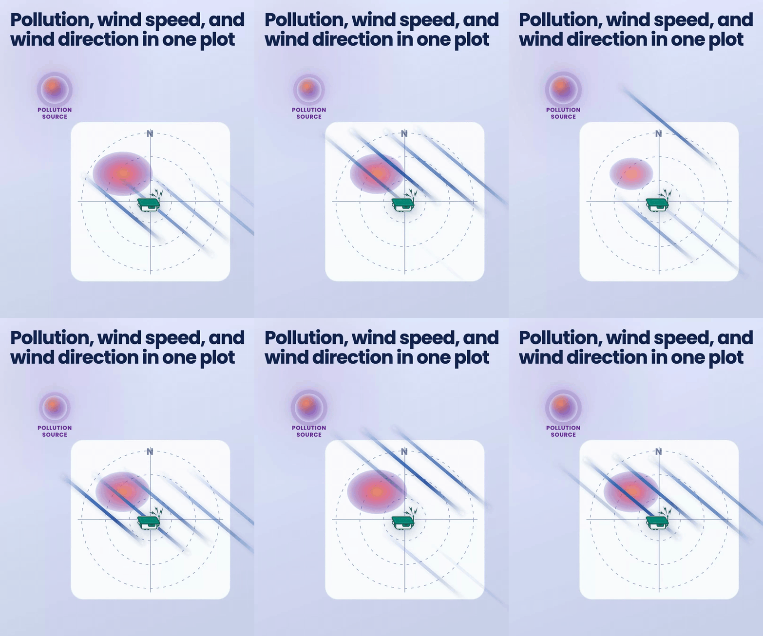
Polar plots brings three things together in one graphic:
The angle around the plot shows the wind direction.
Distance from the centre shows wind speed (calm near the middle with stronger winds further out)
Colour shows the average pollution measured at the sensor for that combination of wind and direction with warmer colours for higher levels.
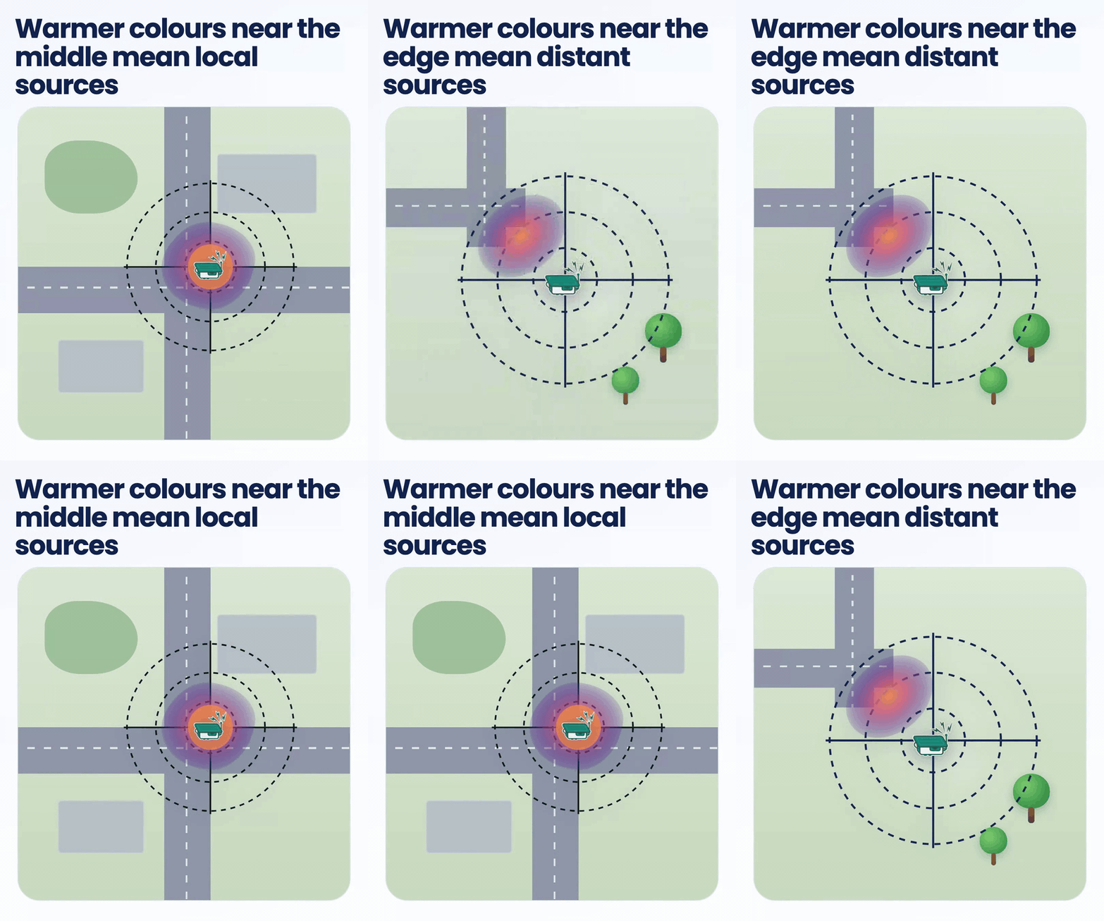
Polar plots can’t identify sources on the ground, but they can help give a sense of whether higher concentrations are mostly local or coming from more distant sources.
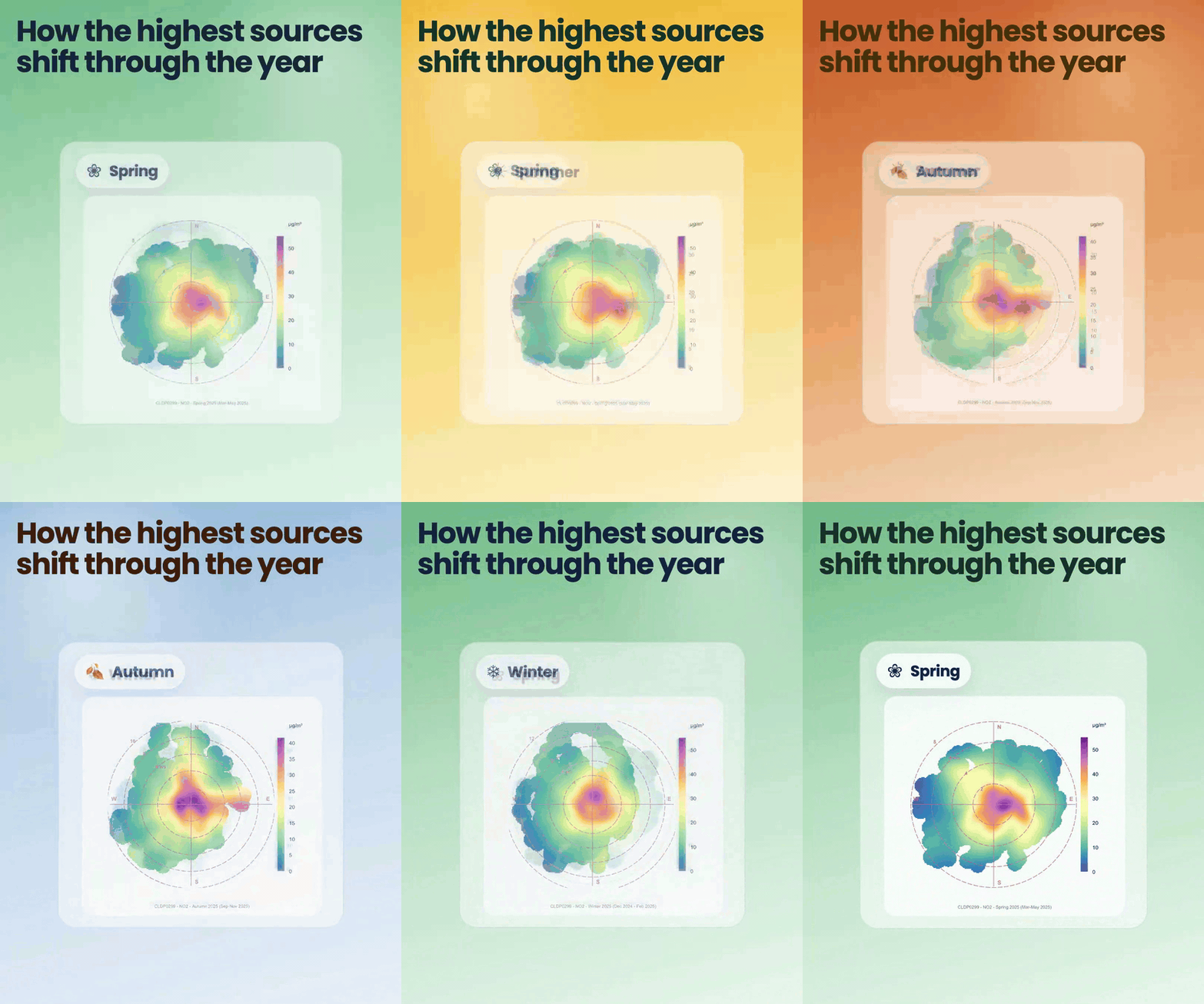
To help decipher if the highest source of pollution detected at the node changes through the year, we also added seasonal plots to the tool.
These are accessed by expanding the ‘Explore more’ bar just underneath the main plot.
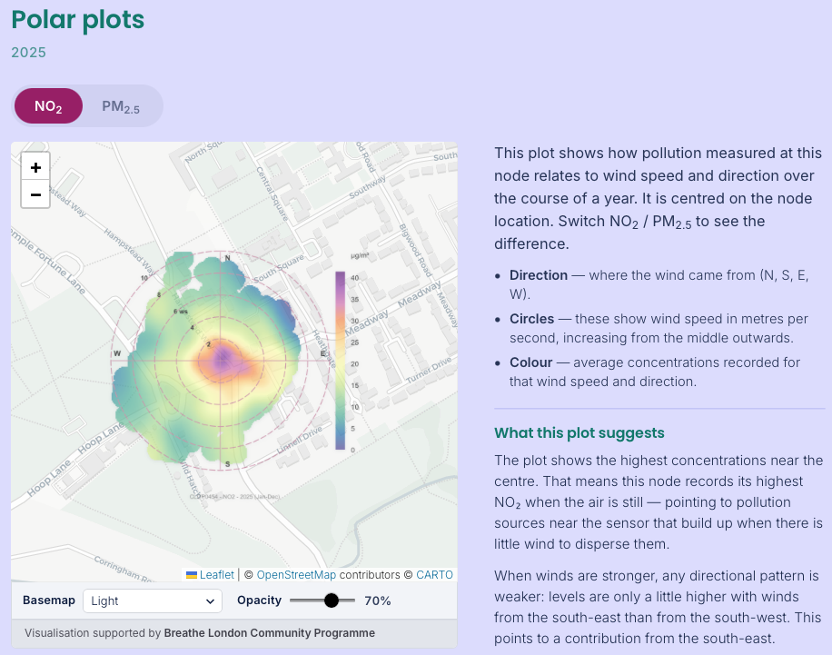
Alongside the plots we have also created text summaries to help describe the main features of the plot.
“One of the most exciting things about the Breathe London Community Programme is hearing from our groups about what questions they are being asked and then seeing what tools, analysis we can create to help answer those questions.”
Head to any of the Community Programme node pages to check out the new visualisations and see how wind affects the pollution levels at the node near you.